Sometimes nature gives you a piece of wood so beautiful that the smartest thing you can do is leave it alone. Other times, you decide to bleach it, dye it bright yellow, and spend the next several days wondering whether you have ruined a $3,000 slab.
This was the second kind of project.
I wanted to build a desk with a shape I had never made before, a guitar-inspired color gradient, and enough practical function that it was more than an expensive experiment. That meant getting uncomfortable with just about everything: drawing curves, coloring unusually soft wood, and spraying a finish I was still learning to use.
The goal was something original that I would actually want in my house. Those two things do not always happen at the same time.
A Curved Desk Design Without a CNC
I cannot draw. If a shape cannot be made with a ruler, there is a pretty good chance I should not be responsible for drawing it.
I tried anyway. After a handful of sketches and a generous attempt to convince myself they were avant-garde, I called my friend Chris from Foureyes Furniture. Chris can design things that do not look like they were drawn during a power outage.
We worked through the shape together on a video call. He offered different outlines, and I contributed highly technical feedback such as wider, shorter, longer, and smoother. Eventually, we arrived at an asymmetrical design with a long sweeping curve and rounded points.
Now I just had to turn that drawing into a real object without using a CNC.
Make the template before touching the expensive wood
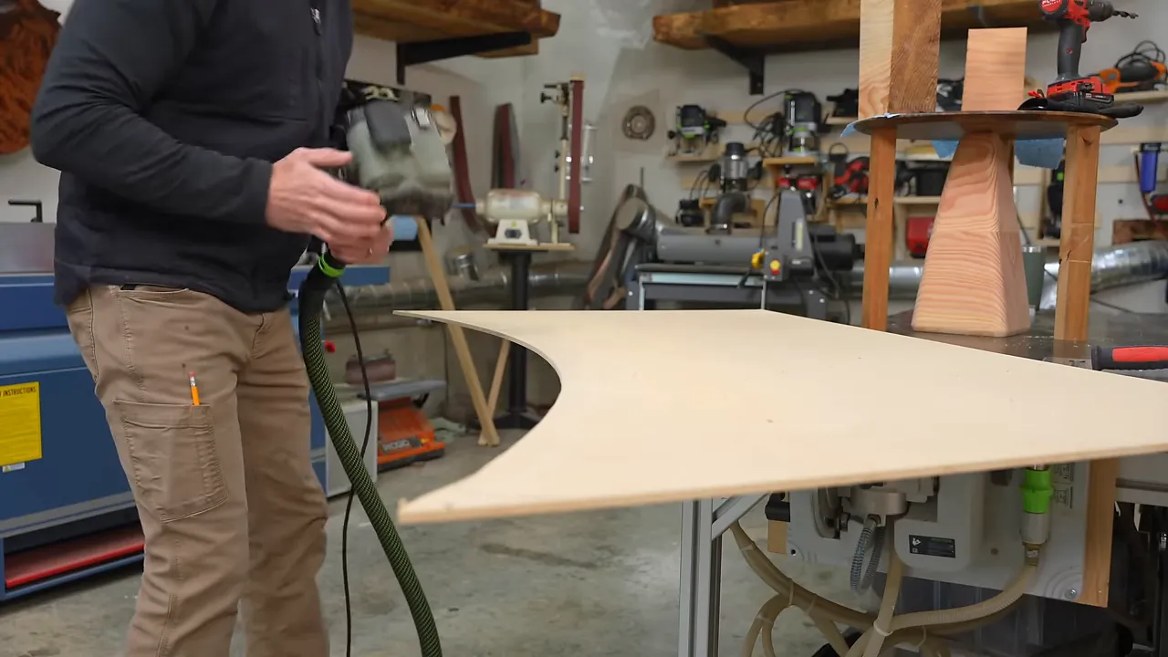
I built the shape in quarter-inch MDF first. That gave me a relatively inexpensive place to take my time, refine the curves, and make mistakes before transferring anything to the slab.
Chris supplied a drawing with reference angles and distances. For the parts that were not quite so ruler-friendly, I used a few less sophisticated layout tools:
- Flexible fiberglass wire-fishing rods established the long, smooth sweep.
- Coffee mugs and other rounded objects helped lay out the corners.
- A jigsaw and hand sanding brought the outline into its final shape.
The important part was getting the template right. Every bump or awkward transition left in the MDF could end up copied into the wood. Spending extra time on the template was much less stressful than trying to improve a curve on a $3,000 slab.
A $3,000 Mappa Burl Slab With a Soft Spot
The slab was mappa burl, which is not maple burl. Mappa is a type of poplar, and this particular piece had been salvaged by a local company, Hamilton Lee Supply. I had two slabs from the same tree.
It was beautiful. It was also incredibly soft.
One lighter section was especially concerning. The supplier explained that it had sat in the rain too long, and that area had started to rot. Since I planned to add dye, I needed to know whether the weakened wood would absorb color reasonably or drink it like a graham cracker.
I tested a random dye color in that area before committing to the design. The result was not ideal, but it looked workable. That was enough confidence to continue, which is not the same thing as knowing what I was doing.
With the template refined, I used it to guide the slab’s final outline. The shape was becoming real. The material problems, unfortunately, were also becoming real.
Collaboration Is Not Cheating
Design has always been a weak point for me. That is not fake humility. I genuinely struggle with it. But struggling with something does not mean you cannot improve, so I study other work and look for inspiration outside my usual projects.
One designer whose work caught my attention was Paul Cocksedge. His furniture and objects felt unusually original, and I wanted to understand how someone develops ideas like that.
Rather than assuming he would answer a message from me, I asked ChatGPT to respond as though it were Paul and describe the elements of great design. To be clear, this was an AI-generated exercise, not advice from Paul himself. Still, the resulting checklist was useful.
The ideas I kept returning to were purpose, collaboration, innovation, and emotion.
Collaboration was immediately my favorite. I had initially felt that getting Chris involved was somehow cheating. Apparently, I was participating in good design practice. That is a much more flattering explanation, so I decided to keep it.
The desk also had a purpose beyond being an experiment. I built it for a giveaway that included five denim-and-epoxy tabletops from an earlier project. Entry also included access to my epoxy table guidebook, which I normally sold for about $15.
The giveaway details page was the official source for that offer. Entry and shipping were free. Any message asking a winner to pay shipping was not from me.
Repairing Cracks Without Staining the Burl
Before the fun color work, there was a substantial amount of less glamorous preparation. I cleaned out cracks, loose material, and burl pockets, then sealed the larger openings so they could hold epoxy.
My temporary dam construction included a board cut six inches too short and enough caulk to discourage close inspection. Fortunately, I was still calling this the design phase.
For the main crack, I used a faster-curing epoxy that hardened in about a day rather than a deep-pour formula. I tinted it black with activated charcoal.
The charcoal choice mattered because I wanted black inside the crack, not a black stain spreading into the surrounding wood. The particles remained suspended rather than dissolving like a dye. Combined with the faster cure, that worked well at limiting color bleed in this pale, porous slab.
Hard epoxy and soft wood do not sand equally
I considered leveling the repair by scraping and sanding it myself. The problem was the difference in hardness: the epoxy was hard, and the mappa was very soft.
Even with careful sanding, I expected to remove the wood faster than the epoxy and leave a raised ridge along the repair. Instead, I took the top to Creative Woodworking and used their wide-belt sander.
That kept the wood and epoxy flat together. It was worth the trip.
Borrowing More Than Color From Guitars
The long curve in the desk started reminding me of the side of a Fender guitar. That led to another idea: a carved body relief, similar to the contour on the back of a guitar.
It had not been part of the original drawing, but it seemed like a detail that could make the desk more comfortable while reinforcing the overall design.
I laid out a series of small changes in depth along the edge, connected the marks with a flexible strip of scrap wood, and shaped the relief. My precision layout instrument had come from the kindling bin, but it did the job.
For the underside, I used the largest roundover bit I owned: a 7/8-inch radius bit. The generous profile softened the bottom edge, and I refined the transitions with hand tools and sanding so the routed sections flowed into the carved contour.
That transition work mattered. A large roundover alone would not make the whole edge feel intentional if it stopped abruptly at the relief.
The difference between interesting and livable
There are several kinds of positive reactions to furniture, and they are not equally useful.
- Something can be beautiful and easy to imagine at home, like a nice walnut table.
- Something can be original and impressive without being anything you would want to live with.
- Something can be well made but familiar enough that people feel they have already seen it twenty times.
The real goal is the combination: something genuinely new that someone still wants in their house.
At this stage, I thought this desk would probably land in the interesting-but-not-in-my-house category. I liked the idea. I was not yet convinced I would like owning it.
Filling What Felt Like Every Hole in the Tree
Mappa burl has a lot of character. In practical terms, that meant a seemingly unlimited supply of holes.
I started with black repair glue sticks for the cracks and larger burl pits. After scraping those flush and lightly sanding, I could see what remained.
What remained was more holes.
For the tiny ones, I moved to wax fill sticks. These are essentially repair crayons, and softening them helped work material into pits that were almost impossibly small.
This approach needed a clear film finish over it. The wax was part of a finishing system that would be coated afterward, not an exposed final surface.
I also became irrationally committed to finishing with one increasingly short fill stick, despite having more in the drawer. Scott pointed out that my fingers were getting close to the heat. He was correct, which was annoying.
Bleaching the Wood Before Adding Dye
The guitar maker who had helped me with coloring wood in the past specifically told me he did not bleach his wood and did not recommend it.
So naturally, I tried it.
My reasoning was simple: the slab had a brown cast, and adding color over brown had given me muddy results on previous projects. If I could remove some of that underlying brown, maybe the yellow, orange, and red would read more clearly.
That was the theory. It was not a guarantee.
The two-part wood bleach made a dramatic difference. Once the treatment had dried, the slab was much lighter, and the side-by-side comparison made the change obvious.
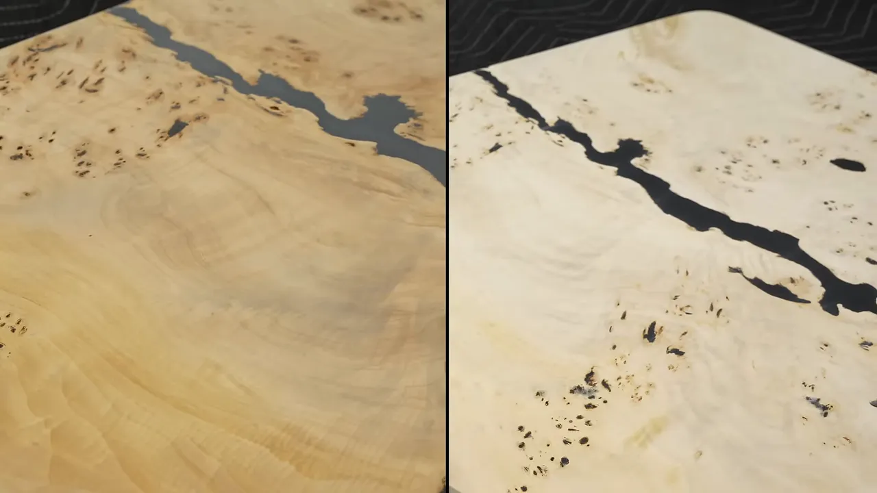
There was a cost, though. The bleach raised the grain aggressively. The surface became fuzzy, much like wood does after being wetted and dried, so it needed thorough sanding before coloring.
This was an experiment on this particular slab, not a universal recommendation. Wood bleach, dyes, epoxy, and clear coats all need to be used according to their product instructions.
Miniature Desks Made Better Color Samples
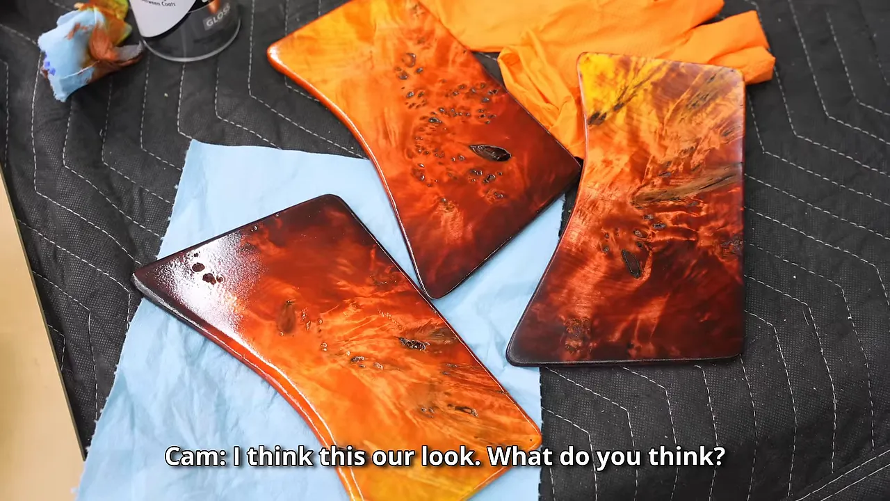
I still did not know what color I wanted, so I made miniature versions of the desk from the same mappa burl. Yes, they were to scale. Apparently, that was where I decided restraint was unnecessary.
The little desk shapes helped me judge the color as part of the whole design rather than as an isolated patch.
I mixed TransTint dyes with ordinary tap water and tried several combinations. The basic process was to apply a fairly heavy initial color, sand it back, and feather additional colors over it.
Some combinations were not working:
- Orange and black had potential, but I kept experimenting.
- Purple and gold developed a college-football identity neither of us particularly wanted.
- A blue option felt too close to an earlier end table.
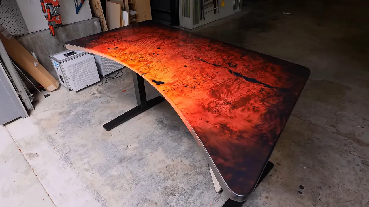
Eventually, I settled on a guitar-inspired look I understood to be called dragon’s breath: yellow moving through orange and red toward a very dark red perimeter.
I built some lacquer onto the samples, too. Seeing the colors under a clear finish was much more useful than judging only the dry dye.
The Dye Job Looked Terrible Before It Looked Good
Scott was not convinced about the yellow. He thought some samples looked too bright.
I assured him that if I stayed reasonably close to the sample process, it would be fine. Then I applied the yellow, and it was considerably more yellow than I had expected.
There was definitely emotion involved. Whether it was the kind of emotion that belongs on a great-design checklist was debatable.
Changing the layering process on the top
After seeing the yellow underneath, I changed my approach for the top. I applied orange first, then sanded most of it away around the center.
The idea was to leave orange in the deeper figure while allowing the lighter surface to accept yellow. Hopefully, the bleached base would keep both colors clear instead of muddy.
That looked promising. Then I added red, and the whole thing went backward again.
Scott compared it to a kindergartener’s finger painting of the sun. I could not offer a convincing rebuttal.
The soft wood made every adjustment stressful. On harder wood, such as maple, I could generally keep sanding until an unwanted color disappeared. Here, I was not sure how deeply the dye had penetrated or whether I could remove it without losing too much material.
The pointed ends were especially risky because they still contained the weakest, most porous wood.
Water helped, but hand sanding made the difference
I kept feathering the colors together and found that adding water helped soften the transitions. I also knew I wanted a nearly black perimeter because those dark edges were what made my favorite guitar finishes so striking.
But the dark border was another commitment. If it soaked too deeply into the soft ends, there might not be a clean way back.
For a while, I kept applying color, sanding it away, and trying again. It may have looked like a controlled process from a distance. It did not feel like one from where I was standing.
The breakthrough came when I switched from the power sander to a hand sanding block.
The power sander was removing too much color too quickly. By hand, I could take away just enough red to control the transition into orange rather than repeatedly stripping the area back too far.
Scott then suggested that more red might not be the answer. We applied orange over the partially sanded red instead.
That finally started to work. The same orange looked richer and more convincing layered over the remaining red. I also softened an overly straight color boundary into a curved transition that tapered toward a point.
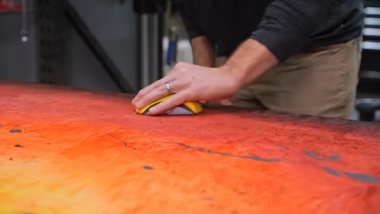
The final result came from restraint, not another dramatic application of dye. Small adjustments brought the orange, red, and dark red together until the surface finally looked intentional.
A Hard Finish Needs Something Solid Underneath
Getting the color right did not solve the slab’s softness.
A hard clear coat over weak wood is a little like clear-coating a saltine. The coating might be hard, but the thing underneath can still crush when something hits it.
I wanted to give the finish a more solid base, so I worked epoxy into the dyed surface and allowed the porous wood to absorb it. The weakened tips took noticeably more than the rest of the slab.
I kept working the epoxy over the surface until absorption slowed, then added two more coats to give the soft mappa as much support as I could.
I removed as much excess as possible, but some drips remained along the edges. Those needed very careful sanding.
At this point, sanding through was not just a small cosmetic mistake. Cutting through the epoxy and into the dye could leave a pale spot that would be difficult to recolor naturally.
Sanding Sealer, More Filling, and a 2K Acrylic Topcoat
For the clear finish, I used a two-part acrylic system from Renner. This was not a sponsored finish, and I was still very much learning how to spray it.
The system uses an activator, and the sanding sealer was dry to the touch in roughly fifteen minutes under the conditions I was working in. That relatively quick dry time was helpful because I had chosen a day with plenty of material blowing around outside the shop.
Use the sealer as a protective buffer
I applied two coats of sanding sealer before returning to the remaining tiny pits.
Those coats did two useful things:
- They made the remaining surface defects much easier to see.
- They created a small buffer between my scraper or sandpaper and the dye underneath.
That buffer was not permission to get aggressive. It simply gave me a little more room to fill, scrape, and sand without immediately destroying the color.
There were still a remarkable number of imperfections to fill. By then, I had spent enough hours staring at the surface that I started reconsidering my original prediction. Maybe this was becoming something I would actually want at home.
The final clear coat
I measured the finish and activator with a food scale, then wiped the surface with a tack cloth before spraying. A friend who paints cars had shown me how much that final wipe could help.
For this water-based system, a small amount of added water helped the finish flow and lay flatter in my application. That is not advice to add water to arbitrary finishes, particularly oil-based products. Follow the thinning and mixing directions for the exact coating you use.
The fresh coat had a bluish cast that made the desk look purple while it was wet. Thankfully, that was temporary.
After the clear finishing work, I applied N3 Nano as an additional protective treatment before mounting the top to its base. I wanted the eventual owner to have a desk ready for ordinary spills and daily use, not just a good-looking object that required constant anxiety.
Choosing a Standing Desk Base That Fit the Design
I use a sit-stand desk myself. On one particularly long voiceover session, I spent about ten hours recording roughly 750 takes. Being able to alternate between sitting for editing and standing for recording makes that kind of day considerably more tolerable.
FlexiSpot sponsored the desk-base portion of this build, and the original plan was to use its E7 Plus. It was presented as the company’s most stable base at the time, with a lifting capacity over 400 pounds.
Once I put the top on it, though, the base felt too blocky for this particular design.
I asked FlexiSpot for a sleeker alternative, closer to the base on my own desk. That worked much better with the flowing top. The heavier-duty base had its place, but this project needed a quieter-looking foundation.
The Desk I Did Not Expect to Want
I am not shy about saying when I dislike a project. Declaring something amazing does not make it amazing, and I cannot talk a bad design into being a good one.
But I love this piece.
I did not expect that when I started. I thought I was building something unusual that I would appreciate as an experiment but never put in my own house. Somewhere between the refined curves, the carved relief, and the layers of color, it became something I would genuinely want to keep.
The useful lesson was not that every risky decision pays off. Several of mine looked terrible for quite a while.
It was that collaboration helped where my own design skills fell short, samples gave me a direction, and switching to a slower, more controlled process finally rescued the color. Getting out of my comfort zone did not suddenly make me good at drawing. It did give me a desk I would never have built by staying comfortable.
|


